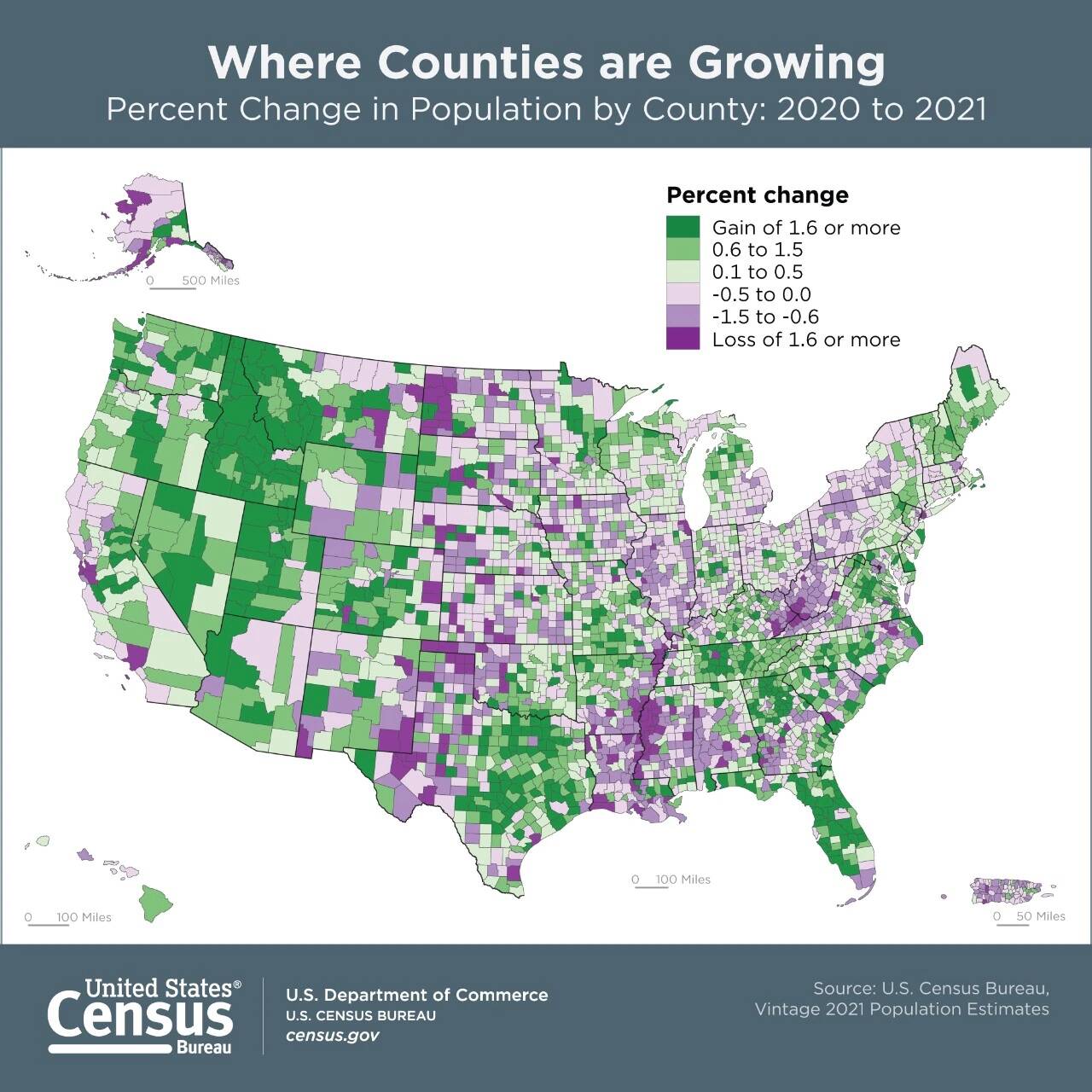
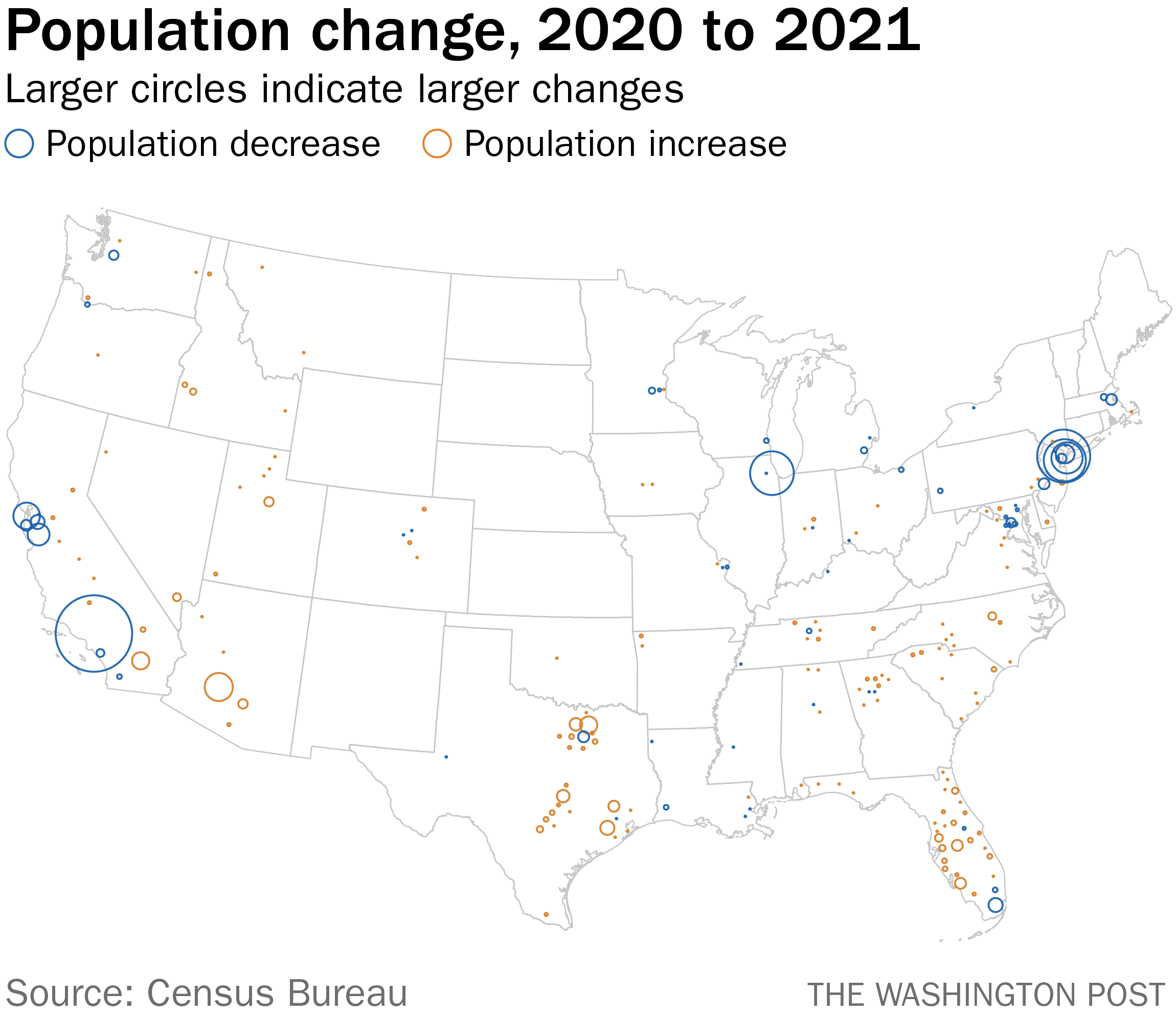
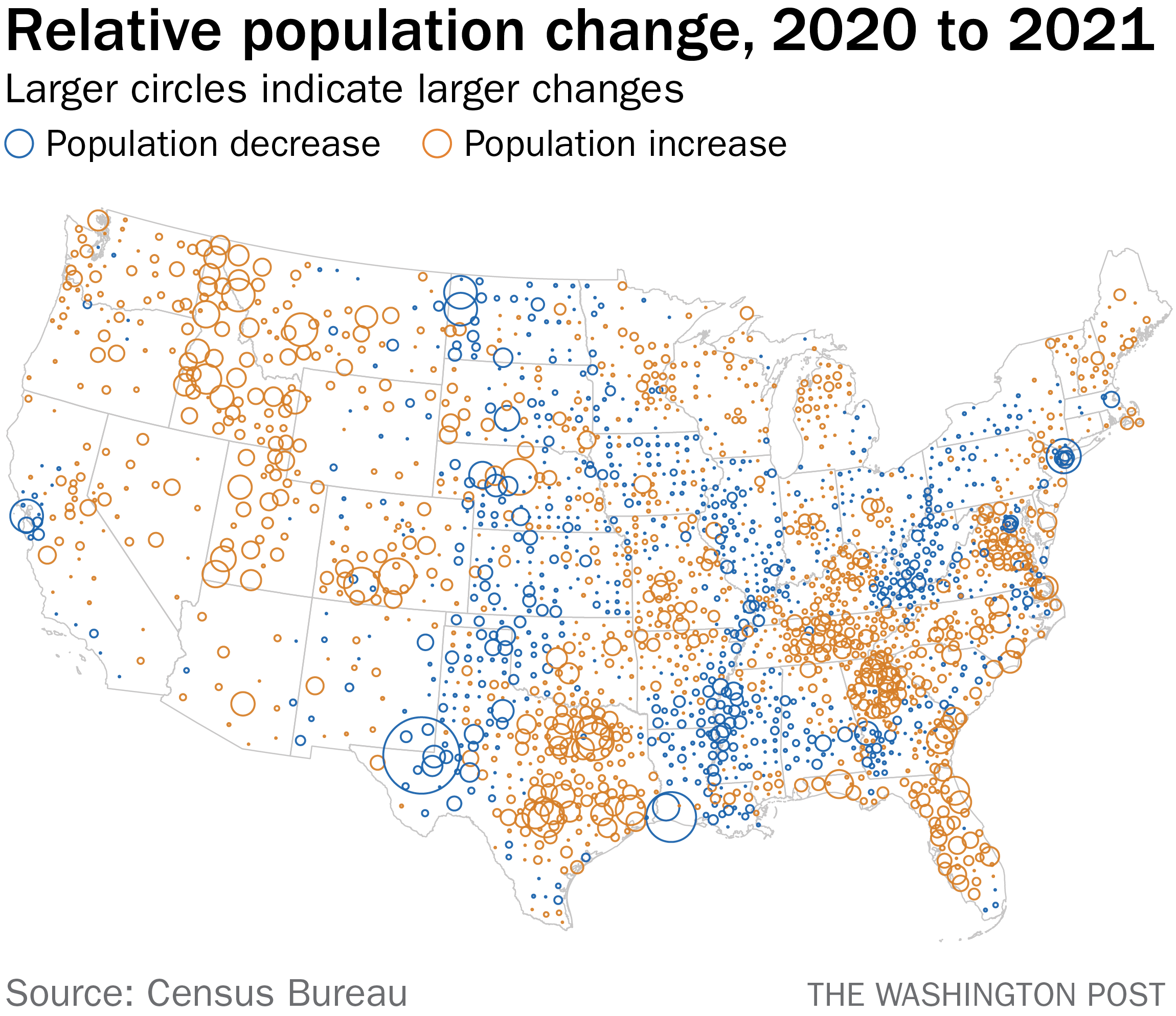
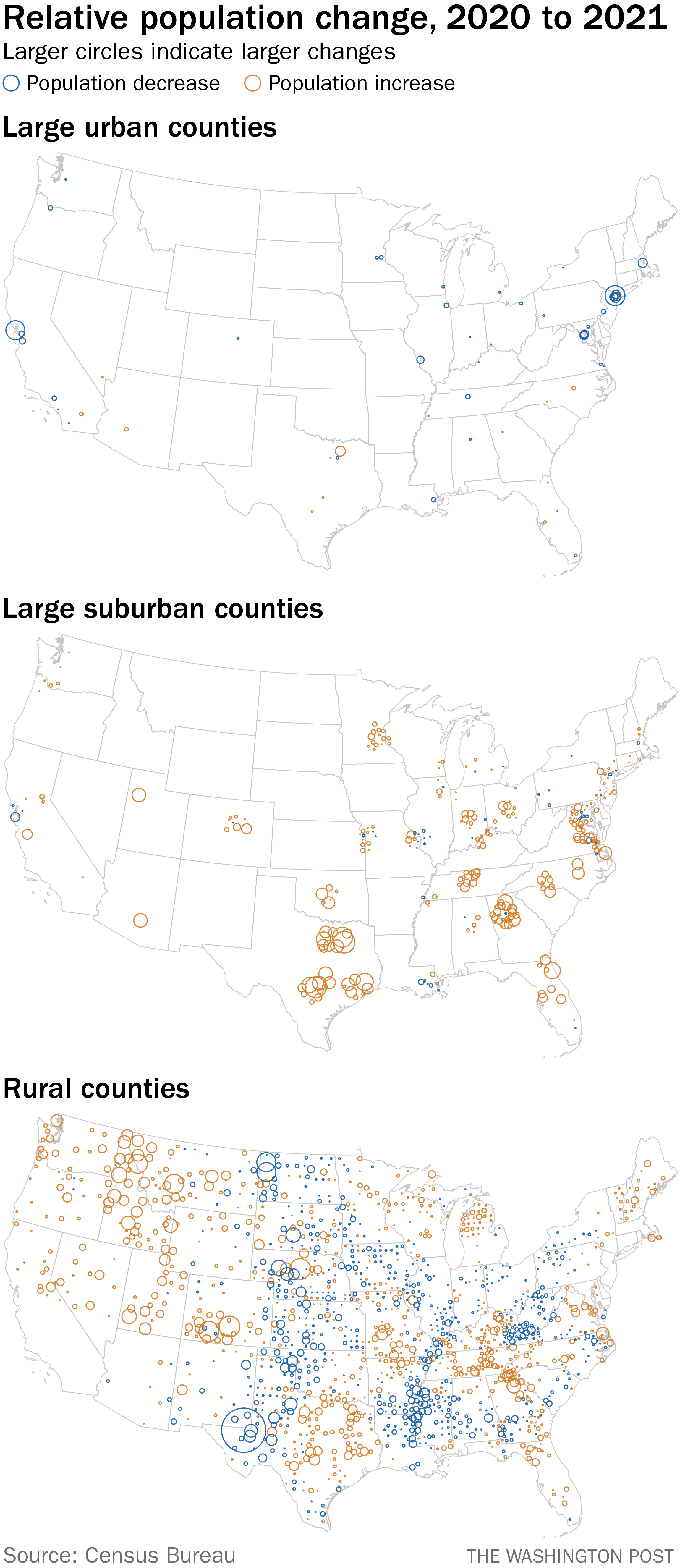
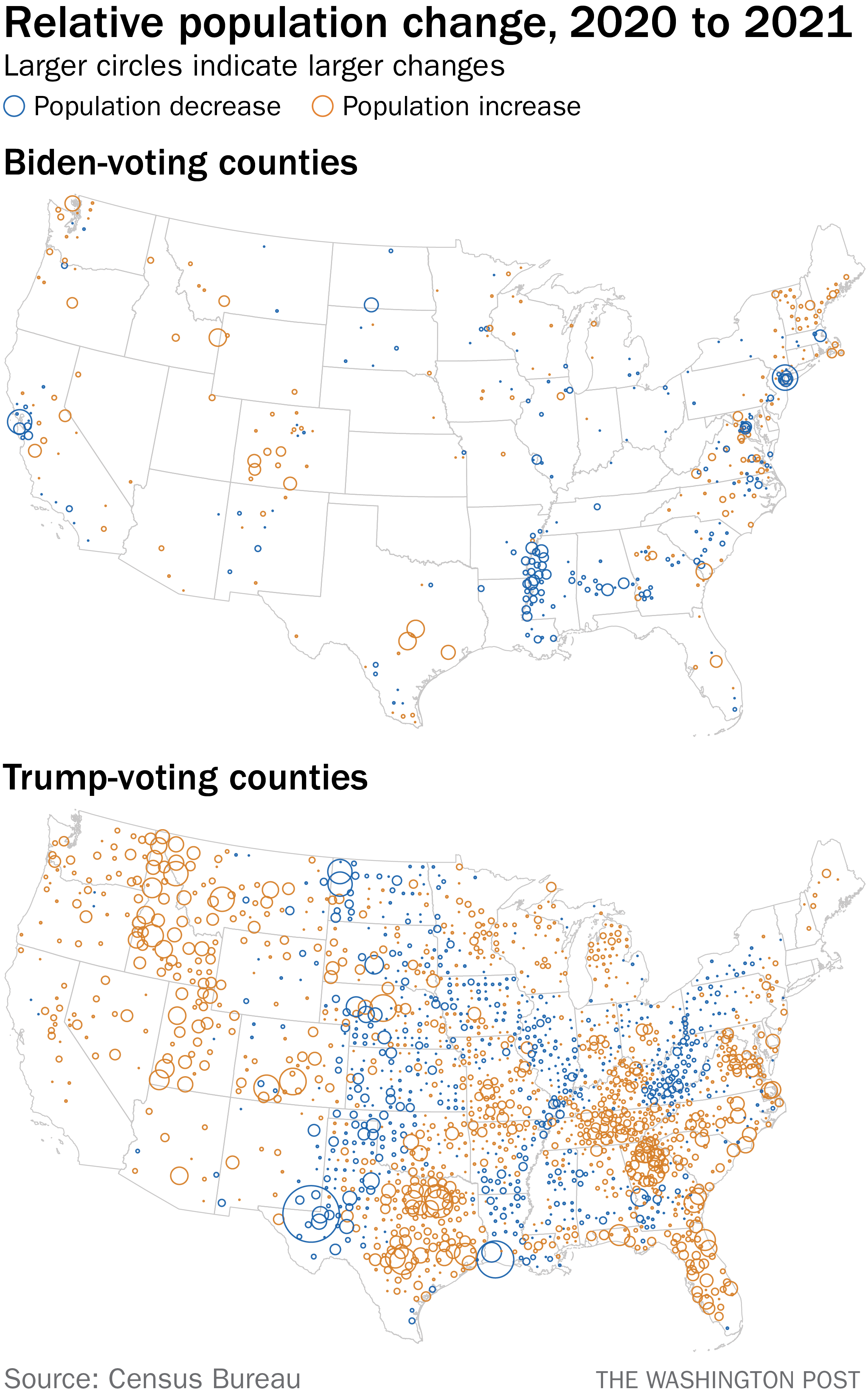
| Did a new neighbor forward this to you? Sign up here. There are slightly higher odds than there would have been two years ago that you are reading this newsletter as you sit in your new home in St. George, Utah. (It is my sincere desire that someone reading this newsletter is, in fact, sitting in St. George, and is currently marveling at/terrified by that introductory sentence.) That is because St. George is the metro area that saw the largest relative increase in population from July 2020 to July 2021, growing by more than 5 percent over that year, according to Census Bureau data released this week. "Relative" is an important qualifier there; the area only added a bit over 9,000 people. The metro area that saw the most raw growth — the Dallas megalopolis — added ten times as many people. As my dad, who moved from Upstate New York to the Dallas area more than a decade ago, joked when he heard the news, "All these Yankees coming to spoil my state." Perhaps you're curious what the pattern of movement looked like nationally during that period. After all, this was as the coronavirus exploded and then waned, spurring all sorts of assessments of how and where people were moving. As part of its announcement about the county-level population changes, the bureau released a map showing that national movement. Poorly. Here is the thing: I love the Census Bureau. I love the history of the bureau and the scale of its data. I love it in an unironic Mr.-Smith-Goes-to-Washington way, an All-the-President's-Men way, all metal desks and flat-blue surfaces and people ruminating over stacks of paper, pencils in hand. This is not what it is, of course, in the way that someone who loves the history and tradition of newspapers might romanticize working for The Washington Post. So it pains me to have point out that the map above is not particularly helpful for explaining what happened with migration in the United States. Because the Census Bureau is great, though, it makes the county-level data available. So we can make our own maps. Which I did. (Using the open-source tool QGIS, if you're curious.) Let's first consider population changes as raw counts. In other words, the total number of people moving out of or into a county over that year. It looks like this, where blue circles indicate population loss and orange ones population increases and the size of the circle correlates to the scale of the change. (Two bits of housekeeping. First, I am aware of the existence of both Alaska and Hawaii. Were I being more assiduous, I would have finagled them into the corner of the image, as one does. But doing so doesn't significantly change the point of this article and the changes in those states weren't particularly dramatic, so here we are. Second, I could also have included a key indicating what circle sizes were equivalent to. But, let's be honest: Those are rarely useful? And since we're making relative comparisons between counties here, there's not much point anyway.) Looking at the data this way has one expected effect: Cities pop out. But notice that the large cities — Chicago, New York, Los Angeles, San Jose — mostly lost population. (Oh, also? This newsletter is going to assume basic things about your familiarity with American geography.) Even Dallas County is blue — meaning it lost population — as it is surrounded by those larger orange circles in its immediate vicinity. This is the story that the Census Bureau elevated in its news release, if not its map. A lot of people moved out of cities. Now let's look at the relative population shifts in each county, the data shown in the Census Bureau's original map. We'll use the same markers, but scaled to the percentage of change. You can see that the general color patterns are the same as the Census Bureau map — that field of population loss running from western Texas up to North Dakota, for example — but now you can also better see gradations of change. More importantly, geographically small counties like those that constitute New York City actually show up. What's more striking is how much more obvious suburbs become. Look at Atlanta, in northwest Georgia. You can see all of the suburban and exurban counties around it because they all saw significant relative growth. Same with Nashville and Washington and San Antonio. Since we have the data in hand, though, let's break that out specifically. Here are the changes in large urban, large suburban and rural counties. You'll notice some patterns. That distinction between urban and suburban alone tells an important story about the changes wrought by the pandemic. The rural map tells a different story: The changes were much less uniform. Some places, like in the Pacific Northwest (and southwestern Utah, home of St. George, where you currently live) (just trying to freak that one guy out again) saw big growth. Then notice all of those counties at the border of Louisiana and Mississippi where there was a consistent decline in population. There may be something else at play here: Those counties are heavily Black and the Census Bureau estimates that it significantly undercounted Black and Hispanic people in the 2020 census. But, as always, I also like to think about this through the lens of politics. And a mixed picture for rural America is a mixed picture for Republican America. Since we have all this data, it's easy to overlap 2020 vote results with population changes. And, in fact, places that preferred President Donald Trump in 2020 actually added about 1.1 million residents from 2020 to 2021. Places that voted for Joe Biden lost about 75,000. Here are those changes broken down. It's not a mystery why Biden counties lost more people: Those are the big cities. Nearly 900,000 people moved out of big, urban, Biden-voting counties and landed in smaller metro areas and suburbs (about half a million a piece). What we don't know is who moved. Was it Republicans fed up with city life? Democrats who will shift red counties to be purple (as happened in northern Virginia)? The best way to find out is to ask. So take a minute and walk around your neighborhood. Introduce yourself to your neighbors and ask when and why they came to your town. It won't take long. St. George isn't that big. |