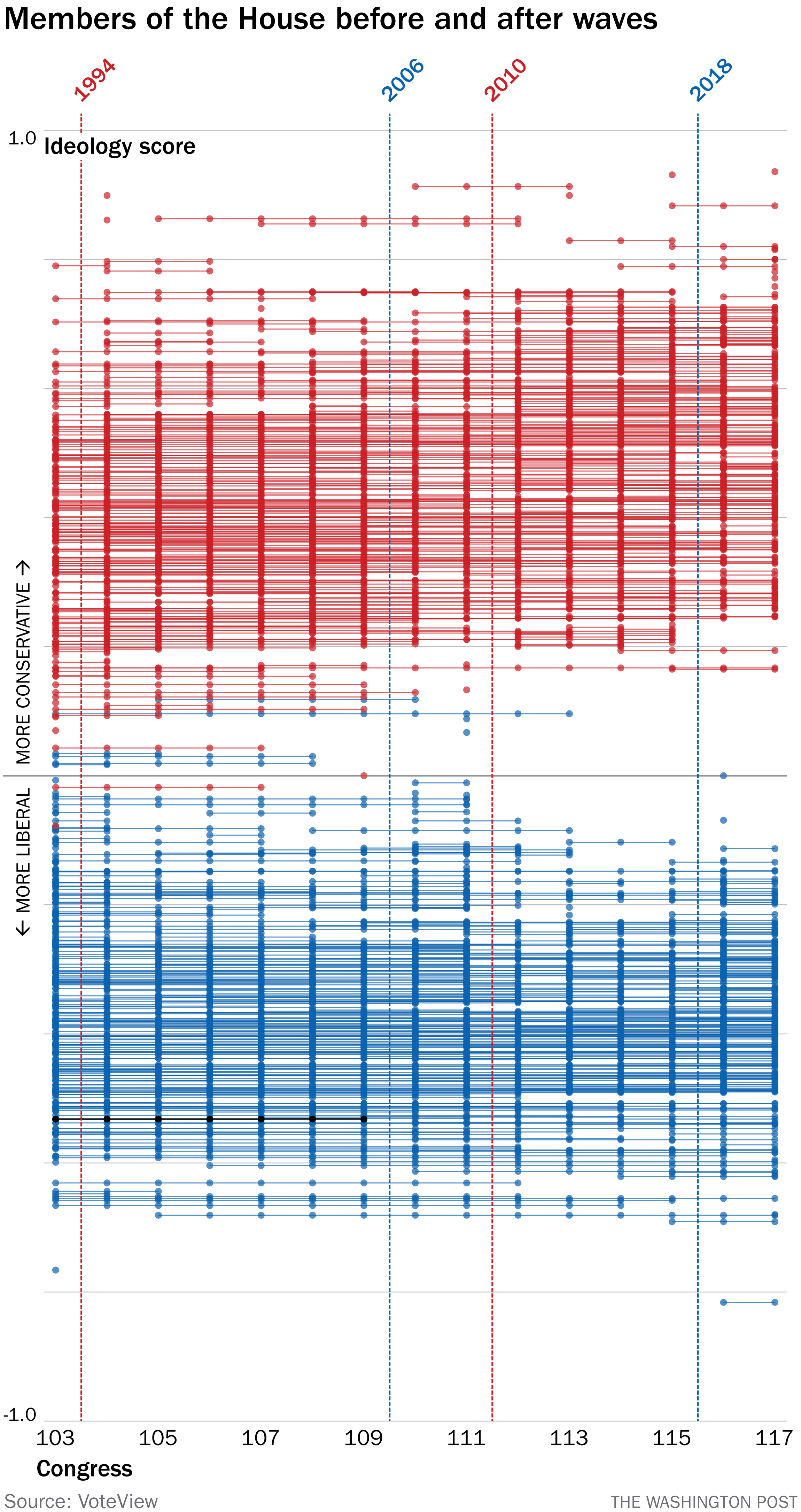
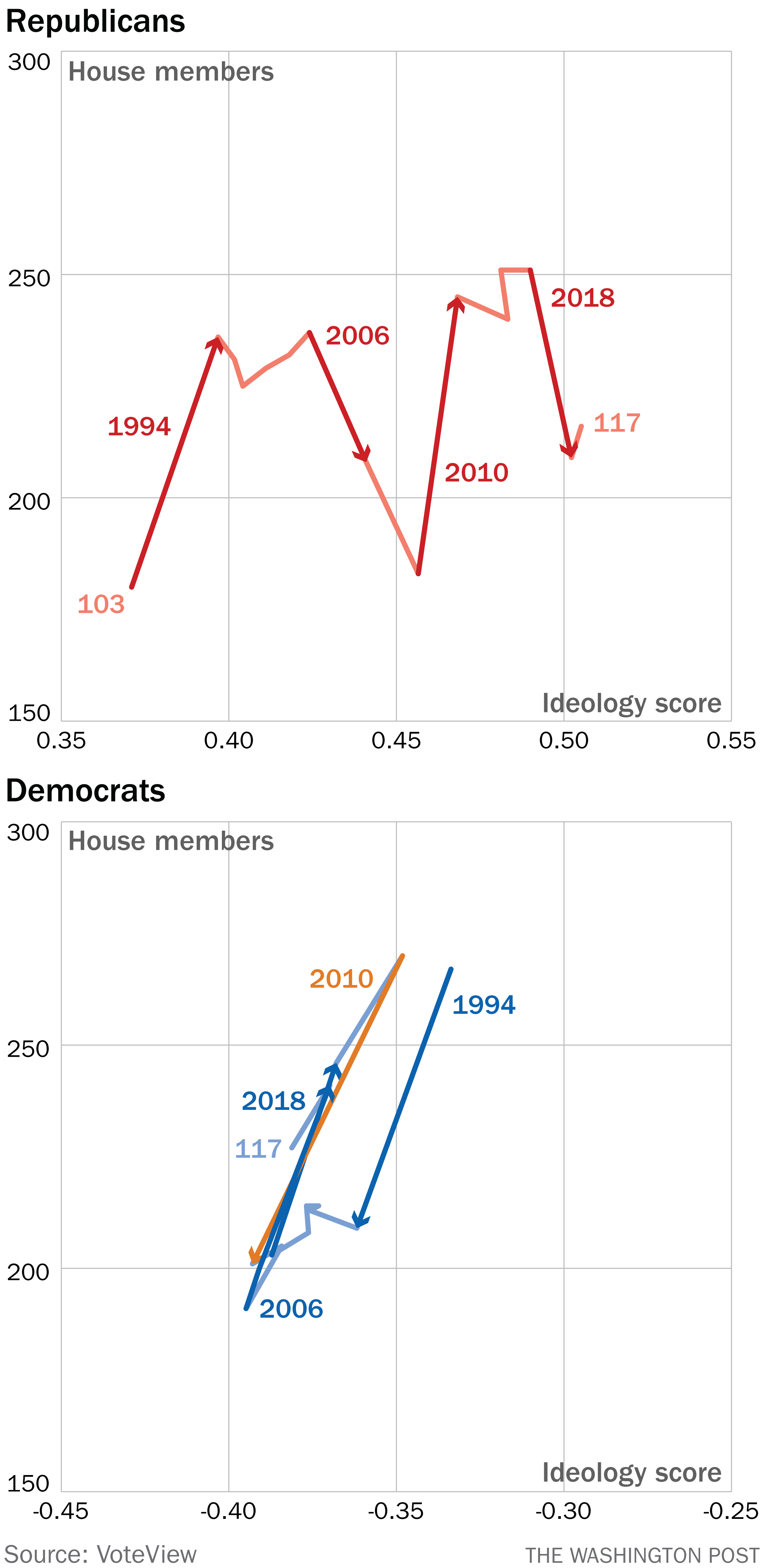
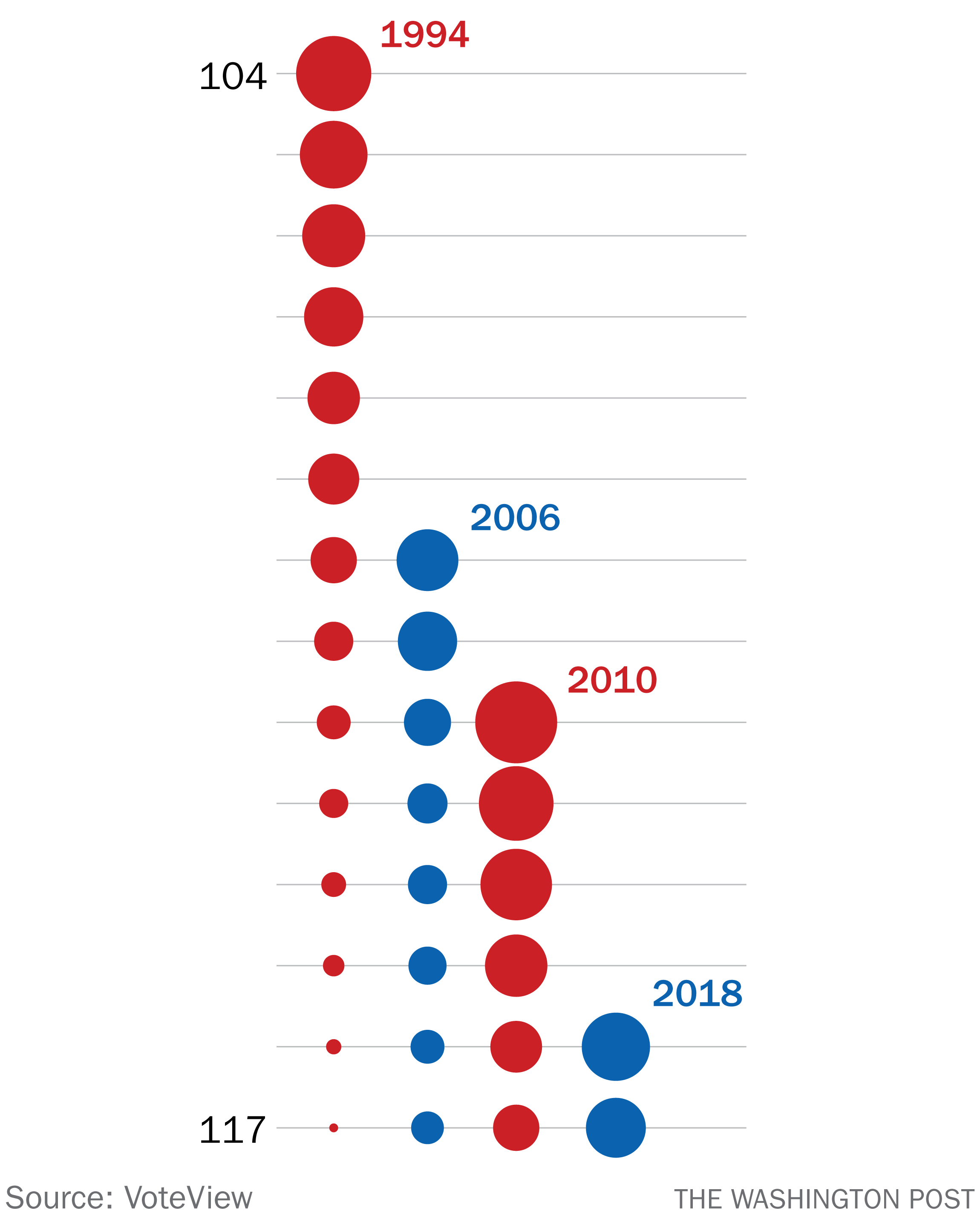
| Did a welcome distraction forward this to you? Sign up here. Here is what we are not going to talk about this week. We are not going to talk about war. We are not going to talk about how our ability to not talk about war is a quiet privilege we enjoy and that it's worth recognizing that, even if only in one sentence that gets at the subject obliquely. We are not going to talk about climate change or tragedy or fury or frustration. We're not going to go full smarm, mind you, rolling out data visualizations about puppies and baby goats and things, but we are going to take a break from the endless exhaustions of the world. Except that we are also going to talk about Congress. I had a question a few weeks ago: How many representatives that were elected in the past four major wave elections (1994, 2006, 2010 and 2018) were still in the House? And, more importantly, how might I convey that information in a visually interesting way? That's right, gang. This week isn't just How To Read This Chart. It's How To Make This Chart. Buckle up. The first thing I did was pull data on members' political ideologies from VoteView.com. There are two reasons I used this as a source. The first is that it includes each legislator who served in each Congress, meaning I wouldn't have to wade through historic House membership data, which is always a mess in one way or another. It also meant that I could track a second dimension of change: How liberal or conservative the chamber was on the whole, using VoteView's DW-NOMINATE scores. (This is a lengthy subject that you are welcome to explore, but the upshot is that it provides a numerical assessment of where an elected official stands ideologically.) At first I thought it would be cool to show the legislators as a sort of swarm, indicating where they were elected and when they left the House. And, gentle reader: This did not work. That chart has a lot of interesting data and one emerging pattern. You can see that legislators, indicated by dots for each Congress in which they served (and using lines to connect House careers) are shown from most conservative at the top to most liberal at the bottom. Each Congress, from the 103rd (beginning in 1993) to the 117th (beginning last year) is shown, as are the wave elections. (Bonus points for finding Bernie Sanders's House career.) What you can't see here is the effect of the wave elections, which was the point. You can see how both parties shed more-moderate legislators (that is, ones closer to the center of the graph), and you can see how the GOP in particular moved away from the middle. But you can't see much about the waves themselves. So I tried another approach. Below, I've graphed the size and average ideology of each party's caucus over time, moving from the 103rd to the 117th Congresses. This worked pretty well for the GOP, since its ideological score kept moving steadily rightward. You can see the effects of the waves, with the 1994 election both increasing the number of Republicans in the 104th Congress and moving its ideology to the right. Then the 2006 wave, reducing the number of Republicans — but still moving the party to the right. Then 2010 — more Republicans, more to the right — and then 2018, which led to fewer Republicans … and a caucus more to the right. Compare that with the Democratic Party, at bottom above. The same gains and losses in membership, but far less ideological movement. Why? Because the pattern is different. In 1994 and 2010, when Democrats were battered by Republican waves, the average caucus ideology moved to the left (that is, became more liberal) because more-moderate legislators lost. In 2006 and 2018 when the Democrats were more successful, the average moved to the right as more-moderate legislators were elected. A design note: I put 2010 in orange on the chart solely to differentiate it from 2018 and 2006, since those all overlap. This is a good sign that the graphic is not doing exactly what I'd hoped. Particularly since the point was to show the erosion of each wave over time. So, at long last, here that is. It's … boring. But it generally conveys what we want to know. Most of the Democrats elected in 2018 survived in 2020 and were serving at the beginning of 2021. So were about a third of the Republicans elected in 2010, the biggest of the four waves. But there appears to be only one Republican left in the House who was first elected in 1994: Rep. Steve Chabot (R-Ohio). Chabot holds a unique distinction, in fact. He was newly elected to Congress in both the 1994 and 2010 Republican waves. After losing in the 2008 election, Chabot regained his seat two years later. Now, he's the last little trickle of the historic 1994 Republican tsunami. |