| Did a NASA scientist forward this to you? Sign up here. There is a certain genre of communications these days that we might call nose-spotting. It involves repeatedly and persistently trying to point out to people that they do, in fact, have a nose on their faces. That, despite any objections, they have a nose and it is there and it is visible and it is attached to them. I mean, not literally. Perhaps there are people who have to do that exact thing a lot, like maybe those doctors who fix bad plastic surgeries. That's not what I'm talking about. I'm talking about the persistent need to point out obvious things to people who refuse to acknowledge them. For example, I have spent a lot of time over the past 500 days explaining to people that there was no rampant voter fraud in the 2020 election, despite what various bedding salespeople might have told them. But that's nothing compared to the noble, tireless cadre of scientists who have been trying for decades to convince people that emitting gas into the atmosphere that can trap heat and warm the planet has trapped heat and is warming the planet. There's your nose, right there. I can see it. One way in which scientists and the science-adjacent (like myself) have tried to point out to people that the planet is warming as a result of human activity is to depict that increase visually. And this week, NASA's Scientific Visualization Studio released a very well-executed graph making precisely that point. It shows the measured temperature in each month, beginning in 1880, relative to the average temperature for that month from 1951 to 1980. And as the years progress, the temperatures keep increasing. Here's just the past 25 years. Each month is shown as a spoke on a wheel, and the temperatures move around the wheel progressively. The farther the line gets from the center, the hotter that month relative to the baseline average. 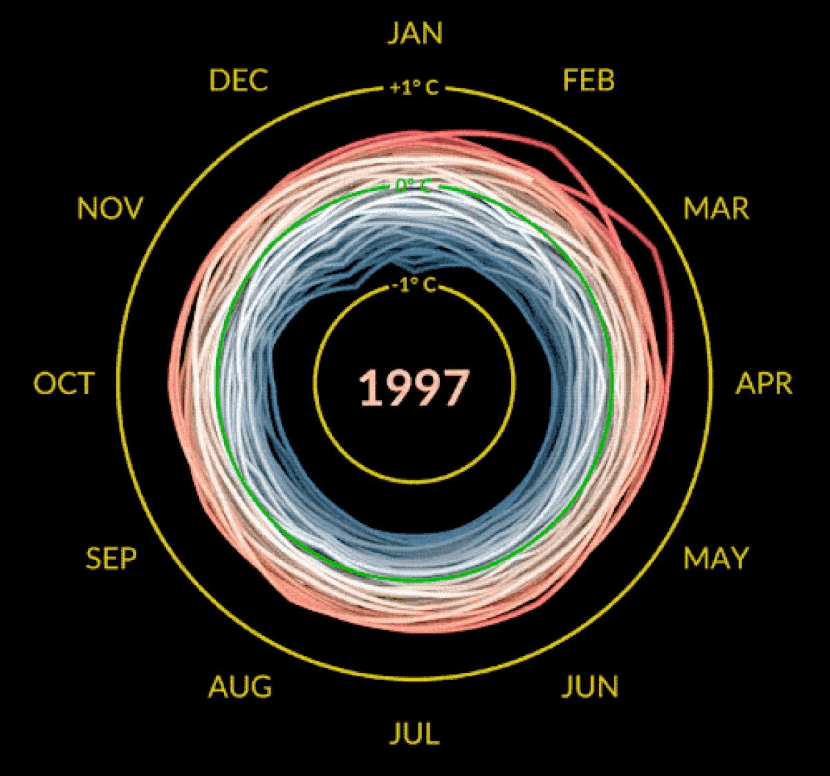 (NASA's Scientific Visualization Studio) | Mark SubbaRao is the lead at the Scientific Visualization Studio and the creator of the visualization. He started out as an astronomer, having worked for nearly two decades at the Adler Planetarium in Chicago before moving to NASA Goddard Space Flight Center in late 2020. In a phone call, he explained that his visualization skills are self-taught, something he picked up as he was exploring how to communicate scientific information. Let that be a lesson to you, kids. Teach yourself data visualization and end up working for NASA. This particular animation was born of the process that yields so many great data visualizations: He had some data and a new software tool and he just started messing around with it. In this case, the software was a video effects program called Houdini. It allows you to quickly create three-dimensional animations. Which, by the way, SubbaRao's animation is. In fact, that's what sets it apart from past iterations of the "climate spiral," as this sort of presentation is known. 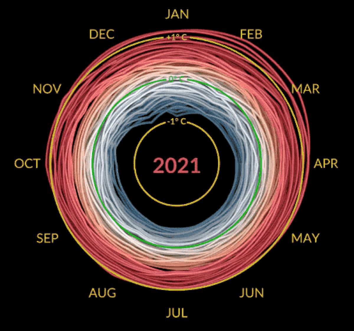 (NASA's Scientific Visualization Studio) | It's a clever (and literal) twist on the spiral, showing how quickly that expansion of the top occurred. After running the image by colleagues, SubbaRao put it on a wall of 15 displays at Goddard headquarters where his team shows various projects it has completed. Receiving strong feedback, NASA released it publicly. And here we are. From a self-taught designer's noodling to your email inbox. And more evidence that you do, in fact, have a nose on your face, however often OilRigsRUs insists that it's just a trick of the light. |