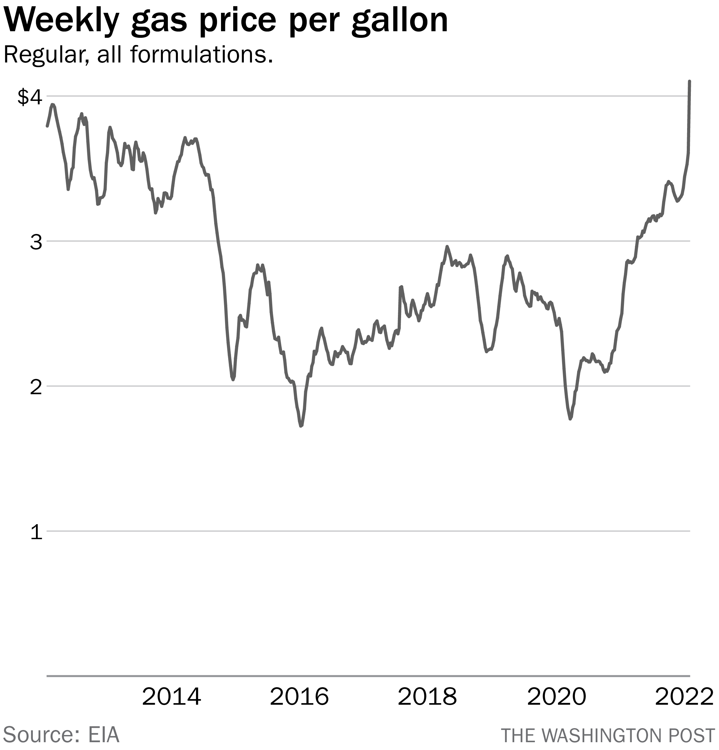
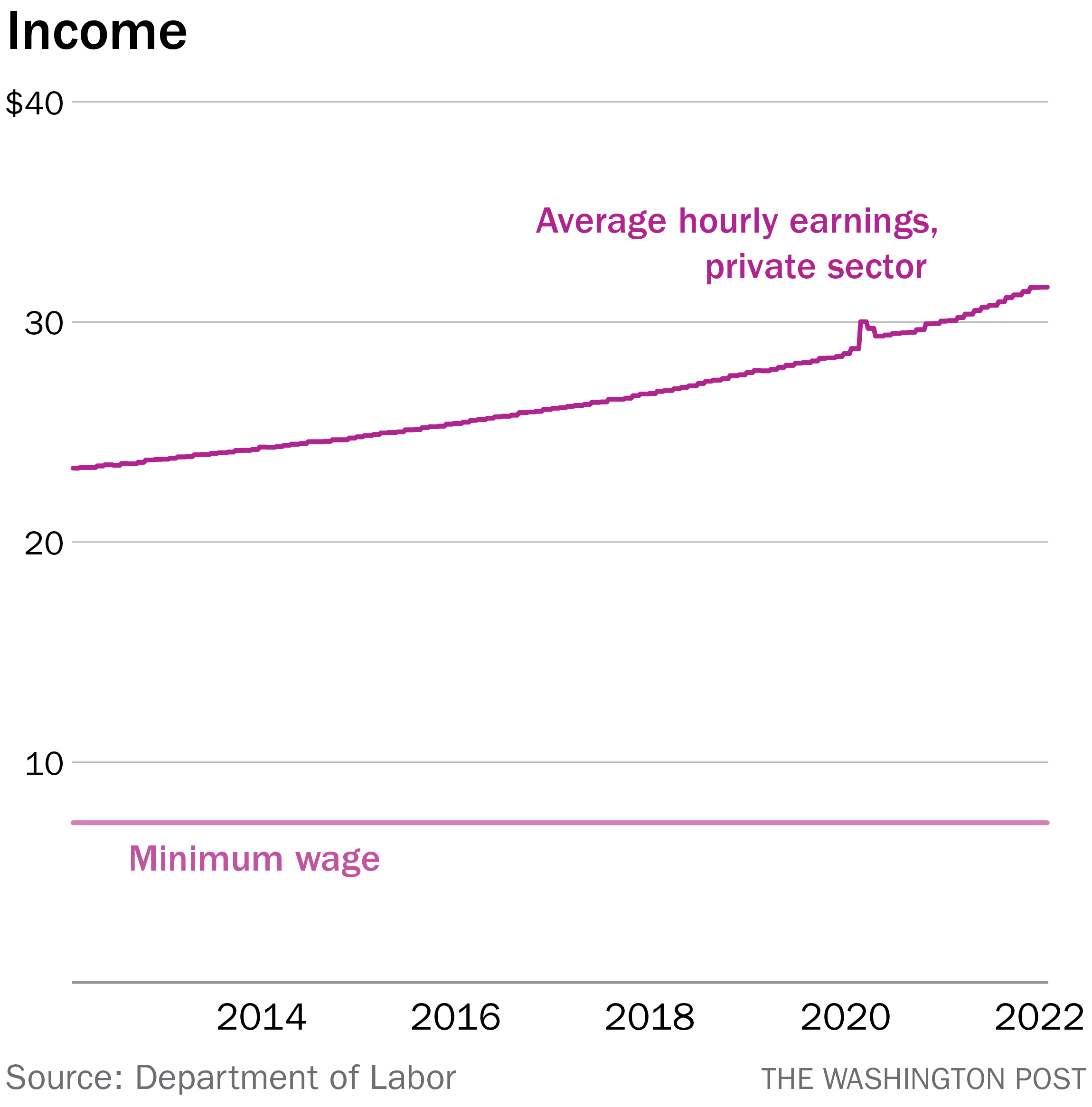
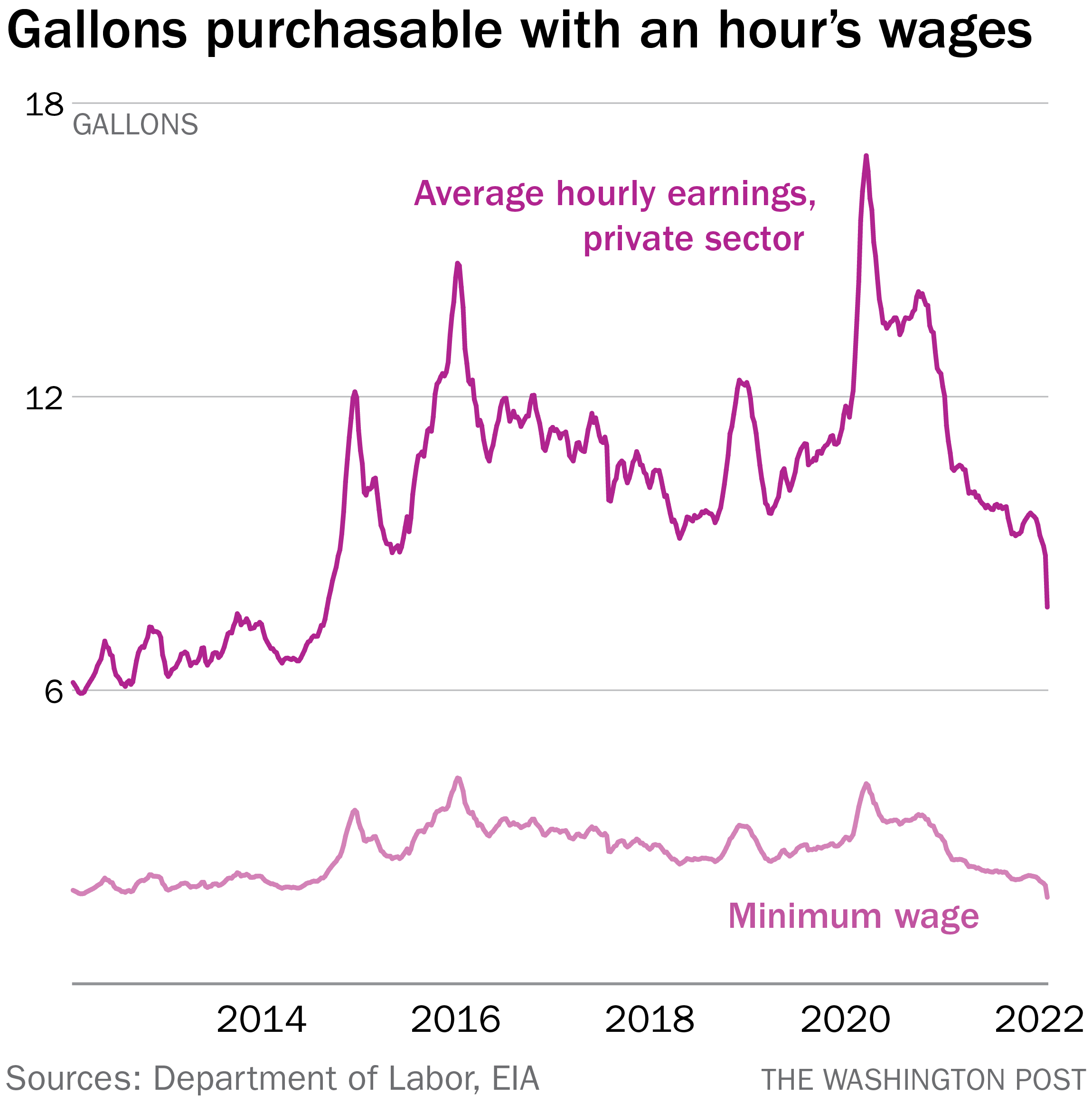
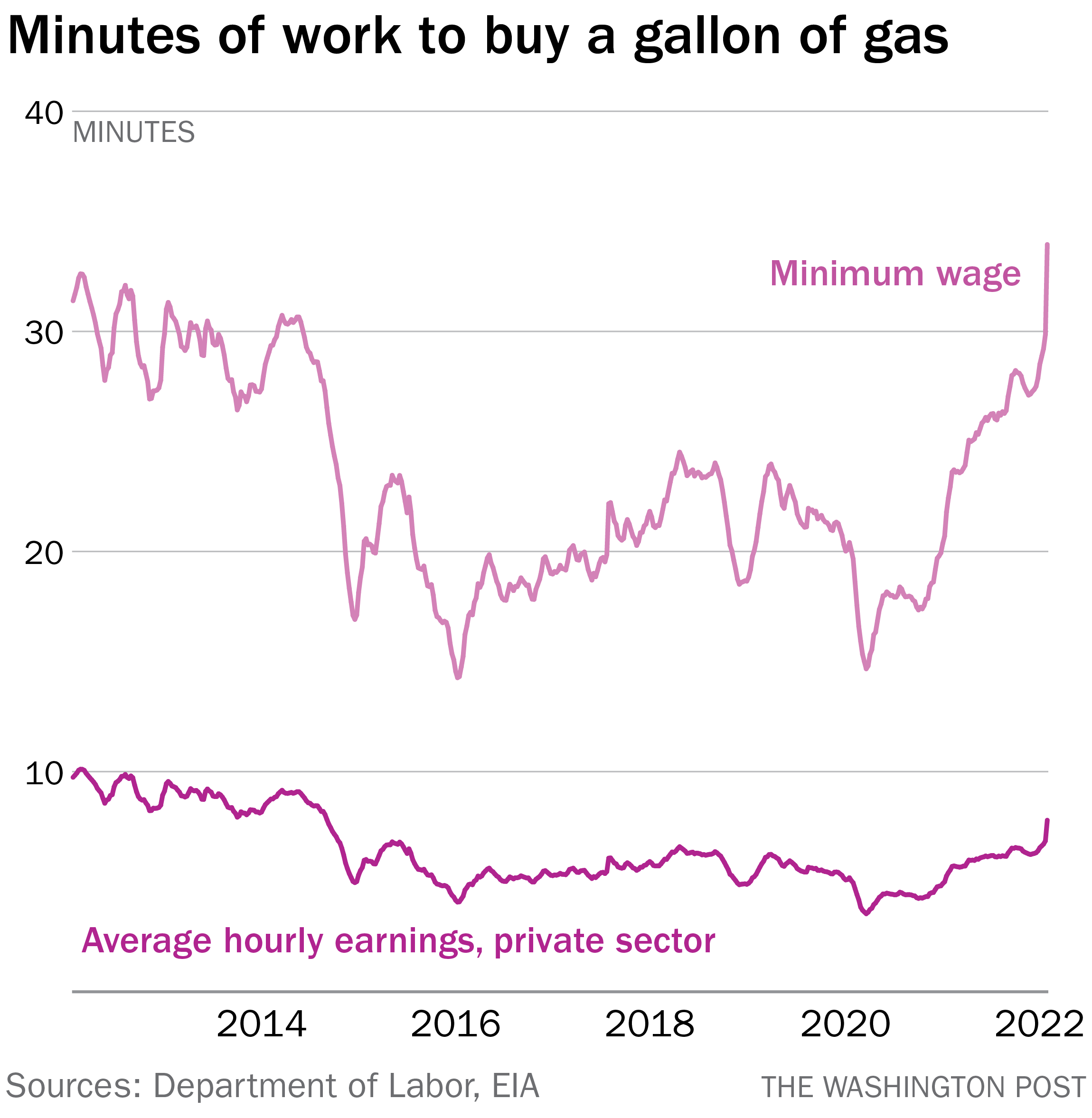
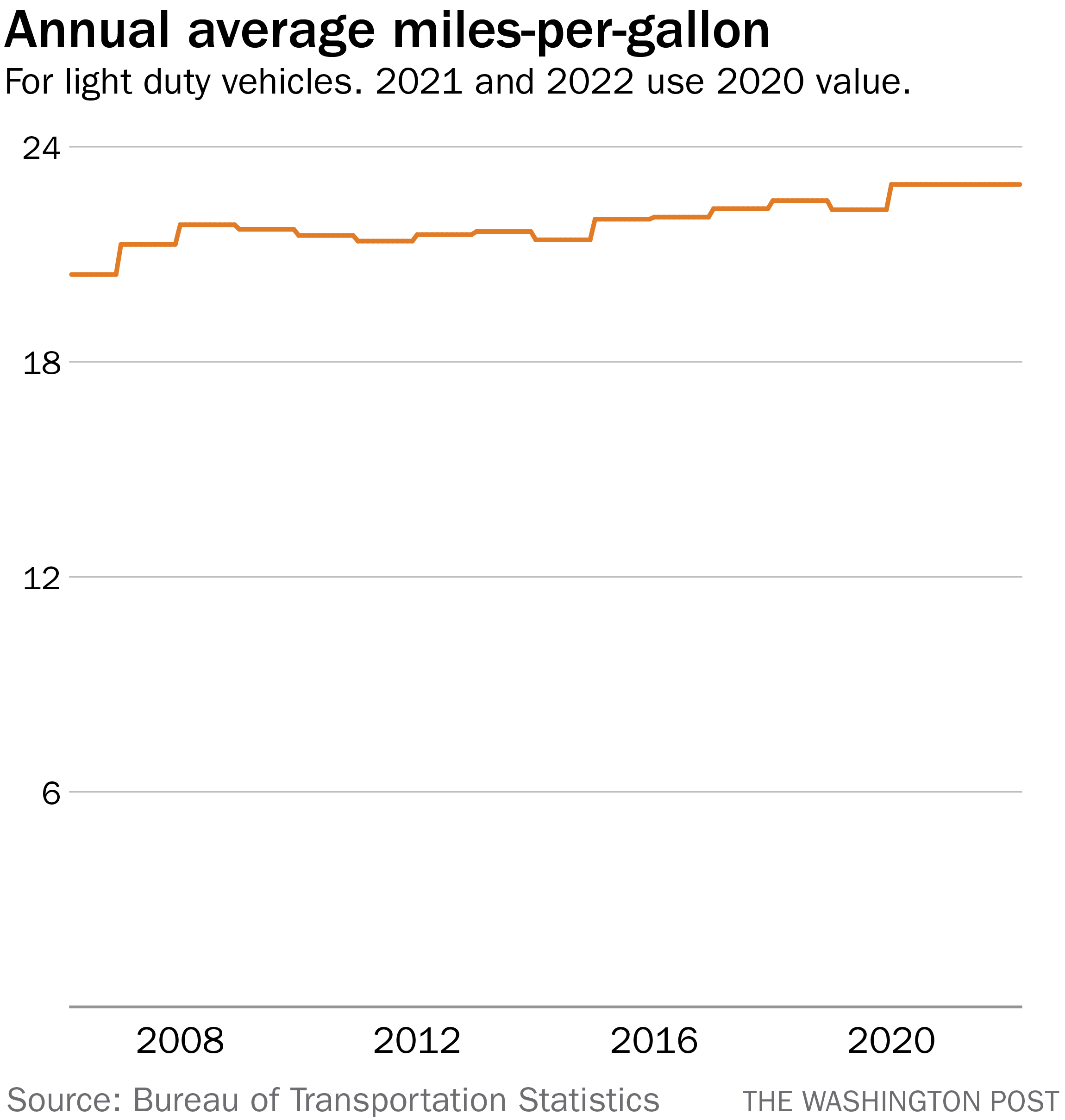
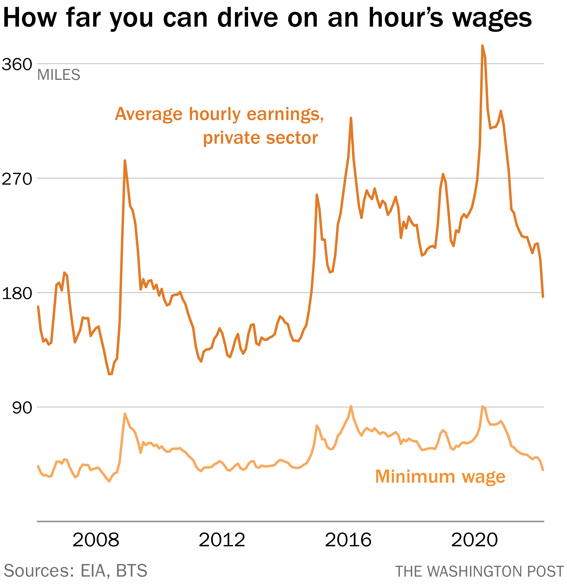
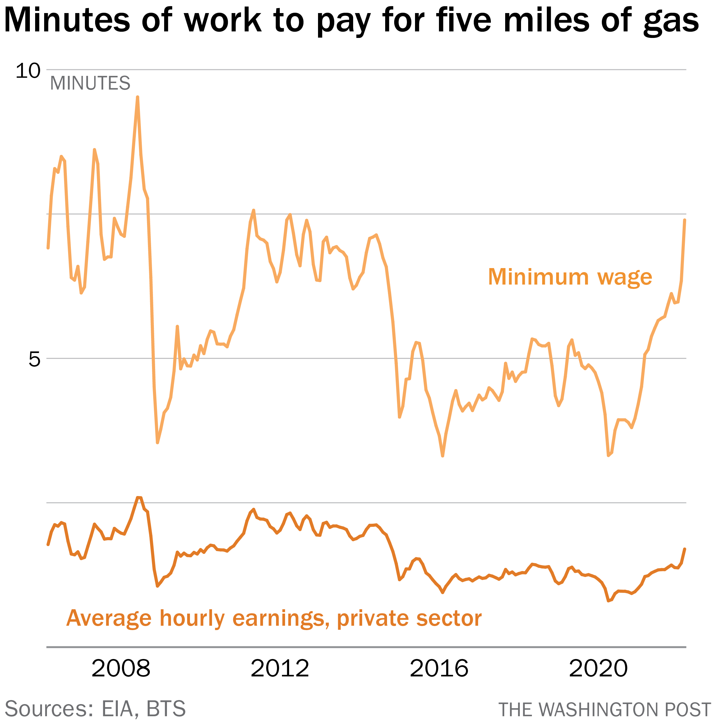
| Did a gasbuddy forward this to you? Sign up here. INTERIOR, A DARK NIGHTCLUB A spotlight shines on a wall covered with brick-patterned wallpaper. ME: (walking into spotlight) What's the deal with gas prices! (quiet coughing in the audience) ONE GUY: Boooo. (The booing is lethargic, hence the period.) YOU: Let him speak! ME: Oh, thank you. Appreciate your support. As I was saying, gas prices are a bit excessive. The economy has had no better luck shaking the effects of the coronavirus than have Americans in general, and a surge in per-gallon prices since the dip when the virus emerged two years ago has been boosted into high gear by the war in Ukraine, like a race car hitting the nitrous oxide. (This is an analogy born of playing video games, not actual knowledge about racing.) So… YOU: Chart! Chart! Chart! ME: Right, okay. Let's visualize that spike, using price data from the Energy Information Administration. This is one of those charts that you could show to the world's least chart-savvy person and they would say, hmm, that doesn't look great, and they would be right. But notice a few things here. The first is that while the increase is dramatic, the actual price per gallon isn't significantly higher than it was about nine years ago. Not that this is good, mind you, but it is a reminder that increases and changes in monetary values over time should be contextualized with changes in spending power over the same period. Or, to put it more bluntly: We should consider the cost of gas relative to what people actually earn. I will admit that this idea was proposed to me by a reader last week and that I then saw a tweet from economist Justin Wolfers that compared gas prices to wages over time. After all, while the minimum wage hasn't changed over the past decade (booo) the average hourly wage measured by the Department of Labor has (yay). So we can reframe our initial graph by considering a different metric: how much gas you could buy with an hour's work at the minimum and average wages. In short, even with the recent spike, you can buy more gas with an average hour's salary now than you could in 2013, thanks to the increase in how much people make. (You can buy about the same amount at minimum wage, since it hasn't.) But, more useful to consider: You can buy a lot less than you could two years ago. Not that we want to rewind the clock to early 2020, given how little interest I think we all have in reliving the past two years, but it's still important to recognize that increased wages even since then haven't softened the effects of the increase in gas prices much. For fun ("fun"), let's invert this calculus. At this point in 2020, it would have taken you about 20 minutes of work at minimum wage to buy a gallon of gas. Now it would take you more than half an hour. After seeing Wolfers's tweet, I saw another from The Washington Post's own Catherine Rampell. She pointed out another relevant factor here: the improvement in fuel efficiency in cars. And, sure enough, the Bureau of Transportation Statistics — one of those government agencies with a name that could not possibly be more on-the-nose — has measures of average fuel efficiency by year over time. (The most recent year included is 2020; for our purposes, we'll just pretend things haven't changed.) So now we can measure not just how much gas one can buy for an average wage but how far it will take you. And that's really the point, right? We don't buy gas just to marvel at its beauty or aroma. We buy it to go places or to make wildly irresponsible bonfires. So if we overlay fuel efficiency, we see a slight shift in our metrics. At the beginning of 2020, you could drive 250 miles in an average-fuel-economy car for an hour's work at an average-hourly-wage job. Now? 177 miles. Or, to again invert the calculus, it will take you about seven minutes, 30 seconds of work at minimum wage to afford enough gas to drive five miles. At the beginning of the pandemic, it would have taken you less than five minutes. These changes are subtle, certainly, but small changes in the price of gas both have ripple effects in the economy (as transportation costs for everything else increase) and an outsize effect on lower-income Americans for whom gasoline eats up a much larger percentage of income. In the abstract, these differences in the number of minutes needed to buy gas are small, but they mean additional dollars pulled out of limited budgets, which is really the point. Prices seeming less-bad when compared to 2012 is not much consolation if you're trying to buy milk. And, of course, gas prices appear to be poised to increase further. I recommend not standing outside of Shell showing people charts to suggest that things were slightly worse nine years ago. You may not get the response you expect. |