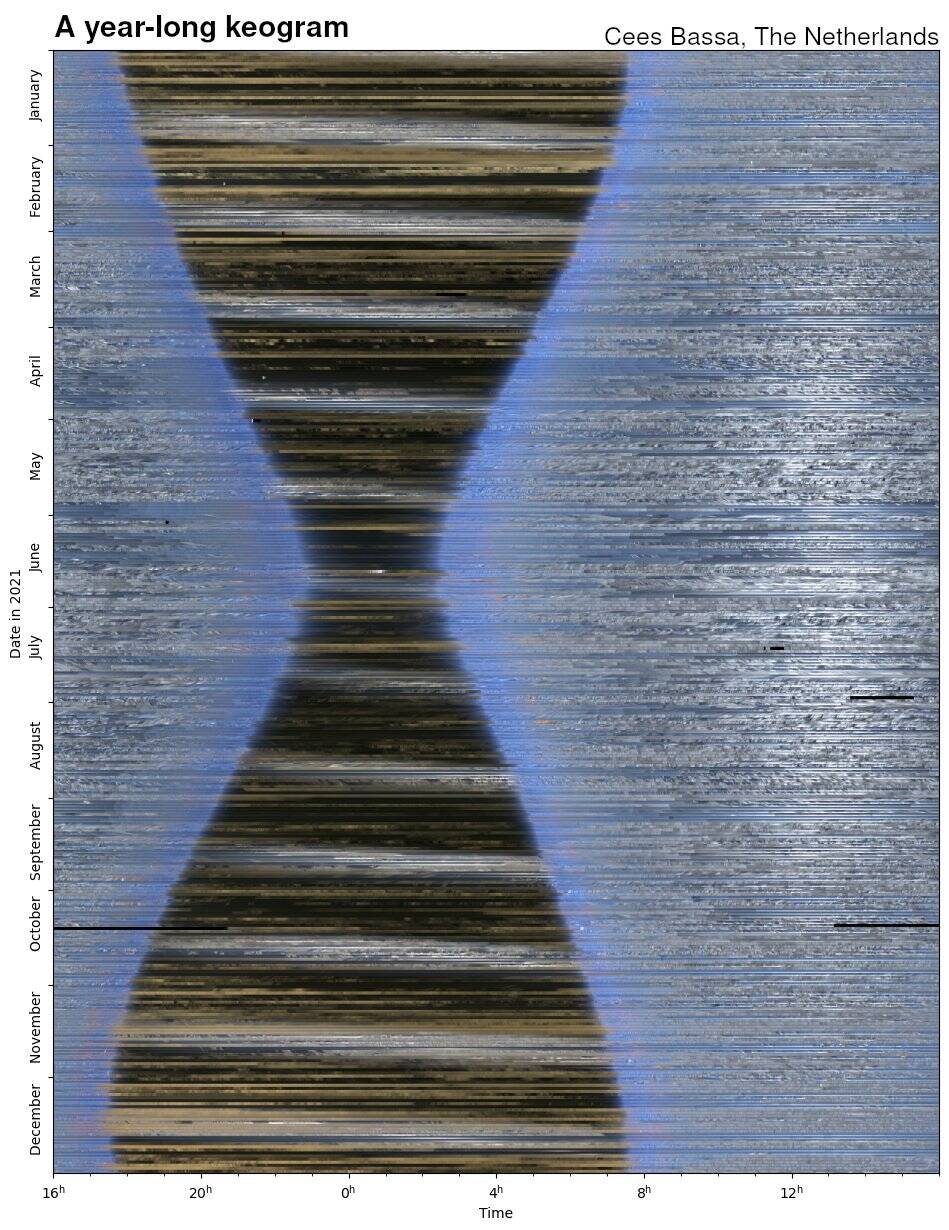
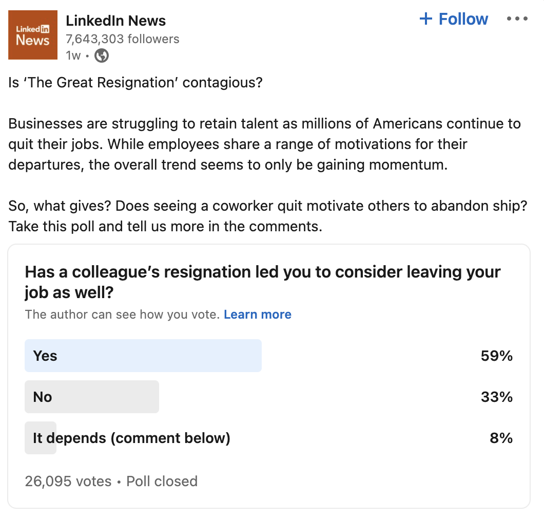
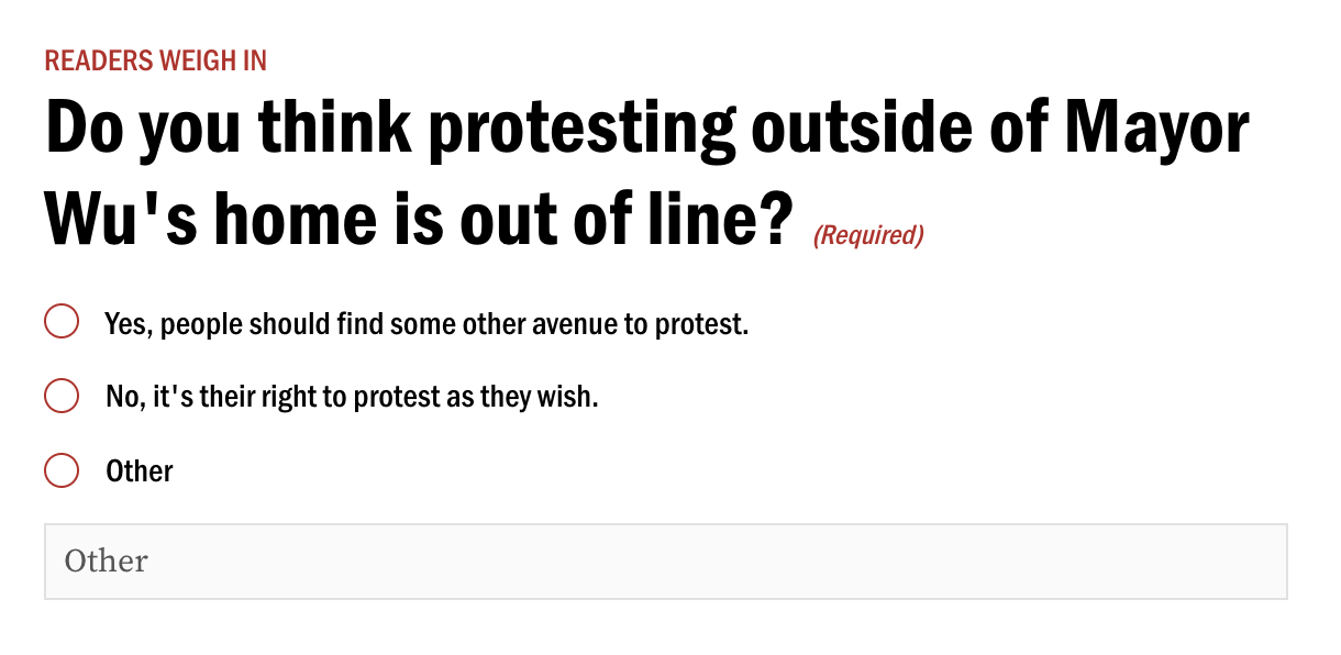
What is going on here? (At some point I will probably stop explaining what the title of this section means, which is that I'm about to clown on something, but that point has not yet arrived. So.) One of the benefits of the Internet is that it brings the world together, allowing, for example, for a reporter in the United States to see a complicated visualization of the sky over an astronomer's house in the Netherlands. One of the drawbacks to the Internet is that it allows media organizations to bring people together to respond to dumb, unscientific surveys, the results of which are then presented as useful, which they aren't. This newsletter will now progress from describing the first phenomenon to the second. Consider this survey, conducted by LinkedIn apparently as one of those 𝓮𝓷𝓰𝓪𝓰𝓮𝓶𝓮𝓷𝓽 ploys of which brands are so fond. There's nothing useful about this. It's a public survey to which anyone can respond meaning that, should someone have had so desolate a life, they could rig the results however they wanted. It's like an ice cream parlor that turns its tip jars into a mock presidential election; the point isn't to figure out who's going to win, it's to get more tips. And yet, there was that LinkedIn survey, mentioned uncritically in a local newspaper in New York. "In a recent poll of more than 21,000 LinkedIn members," Emma Goldberg wrote for the New York Times, "59 percent said a colleague's departure had led them to consider quitting as well." And in a poll I conducted of my Twitter followers in October 2020, 41 percent of people responded that, yes, Superman was real. LinkedIn got a few more responses, but its results were no less dubious. Meanwhile, the Boston Globe was up to the same sort of thing. In a column about threats to elected officials — certainly a legitimate point of concern! — reference is made to "a Boston.com online survey" in which "over 90 percent of respondents felt there is nothing wrong with anti-vax protests" at the mayor's home. That survey looked like this. Not only is this not scientific, it's precisely the sort of thing people would game! It's a question about a potent political topic that also provides an opportunity to cast something seen as toxic as socially acceptable. I understand that this is a newsletter about charts, and I will not try to pretend that the salience of that LinkedIn poll is based on it including a bar chart though technically it does and therefore technically I am fully within my rights to include it here. (Okay, so I will try to pretend that, I guess.) Instead, the point is that the more important part of data visualization is data, that while you can paint a very elegant and appealing picture of horse manure, it's still horse manure. So please don't go out of your way to generate horse manure — and certainly don't pretend that horse manure is not horse manure. |